Wednesday, 21 October 2009

3D!


"Dont let expensive furniture ruin your life...'


Cut out star shapes of Will. These were inspired by 1950-60's comic strips, using cliche bright bold eye catching colours similar to the ones used in the old style sweet wrappers, see context blog. Below trails a b/w version of Will, this is not as effective as the colour version above.


This is a new concept which i think is stronger than the housewife idea. The tag line is mischievous and humours - similar to other ikea adverts it dose not directly link to furniture or ikea itself. It lays around on other themes.

"Don't let expensive furniture ruin your life...' Leave that to men! And other scenarios.

I want to create the scene of a geeky man cheating on his girlfriend.

Here are some of the initial photos which i have taken, similar style to the previous 3D set, needs more work on the arrangement and layout.

More developement shots


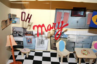
Above shows the final set which i whipped up for the concept, 'Oh Mary you should of gone to Ikea'.

I designed it in a 1950's style, using the idea of a board lonely housewife fed up and sat in a chair. The style of the furniture around was very muddled and mix matched convey the message that if Mary wanted a stress free home she should of gone to Ikea.

On first reflection the aesthetics of the final set were very pleasing to me, as this was the first time which i had created a 2D to 3D set. However the concept itself was poor, not very inventive and I had rushed into it. This was majority because I wanted to experiment and trail the new style of 3D installation that i didn't push my concepts far enough.

It is also after reflation very similar to the memorable Spec Savers adverts using the same tag line. Oh dear, which makes it even worse.


Hand rendered type experiments, using a 150's inspired type face.

Oh Mary..


First trial of 3D 1950's style flat pack kitchen. The concept was to photography a board, dull looking housewife in a setting which was mix matched in scale and didn't look right. Then with the tag line.... 'Oh Mary, turn that frown upside down and pop along to Ikea.'.

However from the photos below this concept doesn't come across very clearly, plus only half the tag line are in these photos! From the reaction of my peers, they said that the kitchen actually looked nice and well presented which was not the effect which i was looking for.

I will have to develop this idea if i decide to take if further - as also it doesn't incorporate the expensive designer furniture part of the brief, but i could change this and interpret it my own way.


Final 2D to 3D back to 2D photographed set.

Ikea brief!

The aim of this brief is to design and produce a viral print promotional campaign to encourage loyalty for females aged 25-30 years old. Ikea has given the tag line, 'Don't let expensive designer furniture ruin your life'. - I have Incorporated this within my designs.

This year i especially set my aims to working in 3D, cutting and sticking making installation sets, working to my strengths and then photographing the scene. I love the effect which this creates, and is becoming more and more popular in contemporary design.

So here we go.....

Friday, 16 October 2009

Example of cropping sections


Cropping sections of the original collage scanned in for possibly flyer designs. Nice interesting sections however at this stage it is essential that i consider where the text for my flyers would go as this holds proitirty over the images used in the flyer. It is what sells & promotes it,

2nd poster design for the set


Samples using a new college of possibly poster designs to match the others created to fit into a set of 4-6A2 posters. To ink each poster there is the constant theme of the geometric triangles and the horses head.

Final flyer


Text at the bottom left indicting the prices and times etc, is not clear. Would need to be re considered and make more bold to create more of an image and increase readability.

Strangeways initial flyer designs


Above shows the original sketch for the flyer. Minimal yet clear. However they do not correlate with the original poster which i have designed, so more thought and consideration needs to go into this if i want to take the idea further.


Here is a sample of the original scan in, using the same concept of the strange and unusual - taking the ordinary form the extraordinary.

Geometric shapes


Maintaining the constant theme of geometric roughly cut out triangles throughout all styles and variations of layouts. this style is very popular within contemporary music design and promotion using a mix of photography, photocopies and vector solid colours.

Text play around


I initially wanted the text to be hanging from the top of the poster - similarly to a puppet. here are some of the designs which i came up with. the solid lines holding up the text work far better than the coloured lines and these were hard to see form a far.

Colour ways


Experimenting with colour ways and variation.

Hand cut out shapes!


Part of my development i trailed using cut out shapes and elements scened in and then placed into the poster design. These did work fairly effectively but it think it over crowed the piece, maybe simple vector solid shapes would be more appropriate.

Plug it in

Plug experimentation's with the materials used and translucently.


The idea behind this piece was that all the girls were prim and proper, sitting up straight and starring directly at the camera like robots. they were plugged into the large scale plug behind them and the broken cord lead to the girl with the horse head on. As though she had transformed and a dark side had been released.

Development


Documenting the playing around of layout and what elements would be Incorporated within the final design. I wanted to use more space up instead of simply placing the three images in the centre of the poster, it was boring.

Wednesday, 7 October 2009

Strangeways brief

To design and make an A3 poster for the night Strangeways at club Wire in Leeds. Live brief and the possibility to have my work distributed over 500 flyer's and posters across Leeds city centre. woo.

Focusing on the concept of what is strange? Chosen to use the concept, removing to expected from its surrounding producing the unexpected.

Below is the initial photo shoot taken, i used three models primp and nicely dressed and asked them in turn to put on the horses head mask - this was the strange, surreal elements removing the expected from its original surroundings.


After the shoot i started to play around with each individual image to see which model worked best in the mask ect. Below are my initial designs of placing the models into the context of the poster.


Play around with background colouring, and stock to be printed on. At the moment possibly targeted too much toward the female audience.


Final business cards


Samples of the final business cards which i have designed, intended to be quirky, humorous and fun. The different sort of business card which i think sends a message out to the viewer to a insight of what i am like.

Final products still need to be photographed...


Logo Development


Logo/branding development for my business cards. I wanted the cards to reflect that my design practice revolves around hand made graphics, including the typography. Cut and stick almost rough and rushed effect. Make shift!

Thursday, 1 October 2009

Self Promotion


Designing a promotional pack to advertise me, stating clearly what i am about as a designer and what i do. I chose to produce a pack which would include print samples of my most current work and a CD which would contain my portfolio. This would be both visual and interactive and hopefully engage with the client/viewer.
Screen shots demonstrating the work and layout in progress.


Intinal design sheets, planning the possibale fromats of the pack, to be exciting/engaging plus the best use of materials and space.