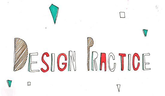

Above is the final proposed poster style for the set of 4 -6 A2 posters.


I wanted the whole juxtaposition of the piece to not make sense - be confusing for the viewer but because of this appealing at the same time.
Above documents trying to incorporate elements of the first poster designs of the girls sitting with tea cups. However it did not work very well as these selected images were far too bright and distracted the attetion formt the background and what the poster was actually about.
No comments:
Post a Comment