
Final arrangement/layout for the hand rendered text. Displaying all the information needed in the specification to promote the club night. I was very pleased with this format and it is neat and concise in a rough square shape it gives structure to the posters.

 Example of placing the text of the initial poster designs.

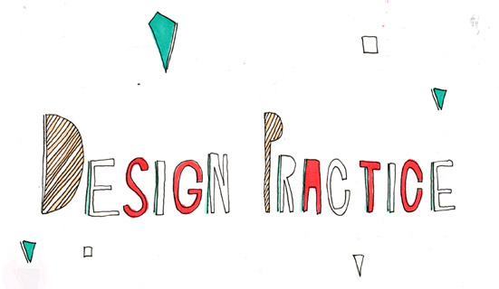
This is how the text for the posters were original jotted down and presented. I then inverted them and placed them in photoshop and cut them all out into separate layer in which i could then play with their arrangement.
No comments:
Post a Comment