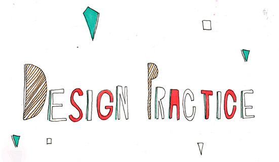
Samples and experiment of typefaces for the back designs of my flyers. I wanted the designs to heavily incorporate the Ikeas brand colours and be simplistic to not detract from the laborious 3D design which i put into the front cover of the flyer.


 I chose to use the font below as I thought it was most appropriate. It matched the font used on the frount cover design and is a strong bold typeface - almost acting as a warning.


No comments:
Post a Comment